Showing posts with label Retrospective. Show all posts

Thursday, December 31, 2020

Retrospective: 1991

It's been nearly 6 months since I started my Retrospective series of posts. This is where I look back at sets in chronological/alphabetical order from the time I began collecting.

The year is 1991. I was still very new to collecting cards, but now that they were on my radar I began to search them out wherever I could. Thankfully during this time cards could be found in a variety of places...grocery stores, drug stores, book stores, gas stations, etc. The collecting bug had already bit me and I was ready to dive in to the world of sports cards.


Bowman


Highs:
   * Huge set, good player selection
   * Low price
   * Card size returned to traditional dimensions

Lows:
   * Cardbacks continued with non-traditional stats

Bowman was a brand so full of heritage, yet I was a rookie (like Chipper Jones!) so to me it was just another set. I didn't really come to appreciate this set until many, many years later. I didn't care initially for the design and I had never seen the back of a baseball card look like Bowman before. Fast forward 30 years and now this is a set I'm anxiously awaiting to build.

Classic Game Series


Highs:
   * Colorful
   * Card backs' layout reminds me of Donruss

Lows:
   * Too much like the previous year

I never had many of the Classic cards in my collection (and still don't) because they didn't seem to be widely distributed in my area. It's fine as even in my youth these wouldn't have appealed to me that much. From my understanding these cards were released as part of a trivia set.


Classic I


Highs:
   * More of the same
   * Expanded checklist

Lows:
   * More of the same

I really don't understand the difference between the "Game" set and this set. Outside the color boarders and numbering, the set is ultimately looks the same. At least the blue looks better than the purple. This is the first of 3 "update" sets that piggy back off the trivia set.


Classic II


High: 
   * More of the same
   * New players added to each team's checklist

Lows:
   * Confusing set

This is the second of three "update" sets, which I never knew until I researched these sets in more depth.


Classic III


Highs:
   * New card backs

Lows:
   * Same front card design

While I don't find the green boarders to be too flattering, I've seen worse. This is the final "update" set bringing the card count to 500 cards.


Donruss


Highs:
   * Diamond Kings

Lows:
   * Design (blue - series 1, green - series 2)

As a kid I loved this set. The names were easier to read versus the cursive used in the 1990 set. The design was bright and colorful and the checklist was large at 770 cards. Today I despise this set. I love the junk wax era, but not every set released during this time period can be a winner. I can swallow 1990 and the follow year would be one of my favorite designs of Donruss of the decade.


Fleer


Highs: 
   * Well laid out card back, full of stats
   * Provisions

Lows:
   * Yellow...and lots of it

I know this set catches a lot of flak from the community, but I liked it as a kid and still do to date. 1991 leer was one of the first boxes I can remember buying and when I discovered there were 4 cards on the bottom of the box, my mind was blown! While the card front has a design that is polarizing, the card backs are tastefully laid out with easy to read stats. The included headshot on the back is a nice inclusion over some of the other sets released at the time. I still have two sealed boxes that I'm waiting for the perfect time to bust.


Fleer Ultra


Highs:
   * Fleer's first super premium set
   * Multiple photos on card back

Lows:
   * Photography isn't "premium"

The Ultra brand was Fleer's answer to Topps' Stadium Club brand. While Ultra would go on to see some nice improvements in the following year, I still like this inaugural set. I had more access to Fleer Ultra as a kid than I did to Stadium Club so I'm a little biased. I like the silver ribbons across the top and bottom of the card and the colorful cardback with multiple photos was something you didn't see a lot of back them. Somehow I ended up with 3 or so of these boxes so I grab and rip a few packs here and there. Eventually I'll sit down and collate this set. Whether I page/binder it I haven't yet decided.


Leaf


Highs:
   * Premium design
   * Gold Rookies

Lows:
   * Reused photo on back

Following the massive success of the 1990 set, this set seemed to fall flat on it's face. It has a premium design (for it's time) and the card backs aren't half bad, but the increased production run ultimately hurt this set. The inclusion of the Gold Leaf Rookies insert set keeps the set interesting with a surprisingly interesting checklist. I'm fond of the set and wouldn't mind picking up a box from each series one day. My biggest gripe of this set is the cropped and zoomed in head shot that is used on the back.


O-Pee-Chee Premier


Highs:
   * Inaugural release of new, original OPC set

Lows:
   * Small checklist

Up until this Premier set was released, the annual O-Pee-Chee sets were basically a parallel of the Topps set. Even though the checklist is small at only 127 cards, the set would go on to see a release for the next 2 years before it would fade into obscurity.


Score


Highs:
   * Large set
   * Fun subsets

Lows:
   * Let me get back to you...

I love this set. The only thing that I don't enjoy about the set is trying to hand collate this beast. At 893 cards it's the largest set of the year and one of the largest card sets to date. The set featured some really fun subsets such as All-Star cards to Master Blasters, K-Men and Rifleman. A friend of mine and I split a box of series 1 back in 1991 we purchased from a small shop in Gatlinburg, TN while there on a youth retreat with our church. I think we both were searching for the Jose Canseco Dream Team card! I have a couple of boxes that I've begun to open, but I do dread the eventual collation day!


Topps Stadium Club


Highs:
   * First super premium set
   * Superb photography
   * Card backs

Lows:
   * UV coating hasn't aged well

I was blown away back in 1991 when I first learned of Stadium Club's existence. These cards were (are) beautiful and helped kick off a whole new segment premium of trading cards. The photography was top notch and the design was very clean. The card backs are beautiful and the inclusion of the player's Topps rookie card is a nice touch. Unfortunately these cards have not aged well, especially sealed boxes as the UV coating on the cards cause the cards to stick together, especially if the cards/boxes were stored in anything other than a cool, dry climate. I recently picked up a sealed box of both series 1 & 2 from an old warehouse and I'm looking forward to sitting down and ripping these boxes, collating the cards and putting them in pages and their own binder.


Studio


Highs:
   * Inaugural set
   * Something different

Lows:
   * Lack of action shots

When the Studio set was first introduced I wasn't sure how to react to the black and white posed photos. With time this set began to grow on me, if for no other reason that it was something different. I'm not a stats guy so I have never poured a lot of time into reading the back of cards. Studio helped change this however with the inclusion of things like their hobbies and pet peeves. A year or so ago I purchased several sealed junk wax boxes for super cheap from a local guy I found on Facebook. This was one of the first boxes I opened and I'm still trying to complete my set.


Topps


Highs:
   * 40th anniversary
   * Iconic design

Lows:
   * Gum stains

Now who doesn't love this set? This is probably one of my favorite flagship Topps sets. From the design to the checklist, I love everything about this set. Of course it doesn't hurt that it also includes a RC of the great Chipper Jones!


Upper Deck


Highs:
   * Photography
   * Second photo on card back

Lows:
   * Dare I say nothing?

While I was having fun with Fleer, Score and Topps, then came Upper Deck. I largely ignored the '89 and '90 sets for different reasons, however the 1991 set began a streak of UD becoming one of my favorite sets annually. From the cardstock, to the photos to the card backs (which sometimes featured a better photo than the front!) I loved every aspect of this set. The price tag was higher than most of the other sets I had been purchasing so I never had a lot of these cards, but what I did have I cherished. I always have a hard time picking my favorite 90's UD set as so many of them are fantastic.


1991 was a great year of collecting for me. It was the first full year since I had been introduced to baseball cards so I had much more of an awareness of what was being released. This would also open up the doors to basketball cards (for a time), but more importantly it got me into following baseball more and more. My grandfather's team was the Braves so by defacto they became my team. 1991 is the season where the Braves went worst to first as well so all around it was a great year. Near the conclusion of the year I was already looking forward to what would come out the next year. For many more years this would be the case as well.

Tuesday, May 26, 2020

Retrospective: 1990

Welcome to Retrospective, a new series of posts where I look back at sets in chronological/alphabetical order since the year I began collecting. These posts will have a decidedly Braves feel (of course) and will feature my overall opinion including the highs and lows of the different sets released.

The year is 1990. This was the year a friend of mine first introduced me to the world of baseball cards and collecting. Prior to 1990 I don't believe I ever paid baseball cards any attention. I grew up playing baseball, but my interest in the sport didn't carry off the field. I didn't know what the term "junk wax" was, let alone had I heard the term in 1990. My eyes were being open for the very first time to a world of collecting something other than Hot Wheels or GI Joe. Little did I know this was the beginning of a very long journey that I'm still taking part of 30 years later.

Bowman


Highs: 
   * The size of the cards returned to the traditional measurements in 1990
   * Minimalistic design lead to larger photos

Lows:
   * Card backs were done in a monotone blue and featured non-traditional stats

I saw very little of Bowman in my first year of collecting. Most of my card purchases came from drug stores or the occasional gas station. Hobby shops weren't on my radar at this time and that's where it seems you had to visit to purchase Bowman. For this reason I don't have much to say about this release.


Classic Blue


Highs:
   * A design that screams 90's
   * Trivia...who doesn't like trivia?
   * I like the inclusion of an autograph space on the bottom of the card back
   * Card backs remind me a little of Donruss

Lows:
   * A design that screams 90's
   * Lack of team logo on the front
   * Minimum stats on the back

Even 30 years later I still don't have many Classic cards in my collection. While I don't actively search them out, I haven't had many sent to me in trades or see them in dime boxes at shows. I kinda like the design and the bright colors and wouldn't mind picking some up...if I can ever find any.


Classic Update (Pink)


Highs:
   * More of the same from the blue set

Lows:
   * I don't mind gaudy colors sometimes, but the pink on these cards hurts my eyes

Like with the blue Classic set, these cards of eluded my grasp thus far. I'm not too big on the pink and blue color scheme so I doubt I'll be searching these out any time soon.


Classic Update (Yellow)


Highs:
   * Color choice isn't nearly as bad as the first update set
   * Trivia and autograph spaces return on the card backs

Lows:
   * Why couldn't Classic have combined these two update sets into one?

I see to have found more cards of the yellow update set in the wild than I have of the blue or pink sets for some reason. While the yellow isn't nearly as bad as the pink used in the other update set, I still prefer the blue. My love for bright yellow cards hasn't yet come to fruition (though that happens next year courtesy of Fleer!)


Donruss


Highs:
   * One of the first sets I was introduced to
   * Diamond Kings
   * Card backs feature a decent amount of stats and other info

Lows:
   * Design - it may be "iconic" 30 years later, but it hasn't aged well
   * Lack of a team logo on the front
   * I never cared for how the players names differed from the front to the back
   * Very thin cardstock

This set holds a special place in my memories as it was partially responsible for getting me hook on cards in the first place. While it's not the worst design by Donruss (the 1991 set holds that designation) this set hasn't aged well. As a kid I had a hard time reading the script used on the front for the players name. Today I like the script used as it's different and stands out from other sets released during 1990. I keep resisting the urge to take a trip down memory lane and build this set. So far I've resisted, but the cheap prices on sealed boxes does make it tempting at times.


Fleer


Highs:
   * Clean design
   * Colorful an well laid out card backs

Lows:
   * Boring photography on many of the cards

While most of my 1990 collection consisted of Donruss and Topps, I did manage to find a few packs of Fleer here and there. I was a fan of the overall design. The colored ribbon around the photo combined with the white borders were a nice tough, especially when compared to some of the "louder" designs of Classic, Donruss and Topps of the same year. I don't have much attachment to this set and as a result I've not sought out many of the Braves.


Leaf


Highs:
   * Clean design
   * Good amount of stats and other info on card backs

Lows:
   * Scarcity
   * Higher price tag

I remember the first time I saw these cards in an issue of Beckett and I instantly was intrigued. The design (front and back), the player selection, the photos...I loved everything about this set. Too bad cards from this set were out of my grasp for the most part in 1990. I would eventually track down most of the Braves, but now I'm looking for other key cards in the set. I've never opened a pack and would love some day to crack a box and build this set.


Panini Stickers


Highs:
   * Surprisingly feature some good action shots

Lows:
   * Stickers, not cards

While technically not cards, Panini was the king of stickers and still is today. It would be several years into my collecting before I would come across my first Braves sticker. I've never seen the album these stickers go in, but that's OK as I treat them as very thin cards!


Score


Highs:
   * Colorful design
   * Cardback features color headshot and packed with stats and info
   * Large set to build

Lows:
   * Multiple colored boarders
   * Bright borders are a dead giveaway that this set is from the 90's

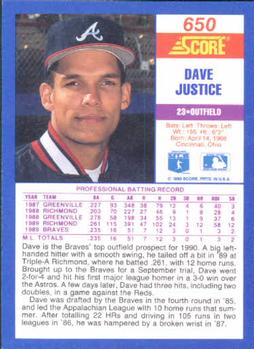
Score is another brand that I didn't see a whole lot of in 1990, but would go one to become one of my favorite sets each year. Initially the only '90 Score card I would have in my collection was this RC of David Justice. Eventually I'd pick up the rest of the team set. 30 years later this is a set I've been eyeing to buy a box or two of and building the set. My only real gripe with this set is the use of different colored borders. I wish they would have stuck with one color, preferably blue.


Sportflics


Highs:
   * Lenticular technology
   * Card backs

Lows:
   * Curling cards
   * Small set

I have always loved lenticular trading cards so imagine my surprise when I discovered the Sportflics brand years after I started collecting. The cards don't scan or photograph all that great, but are fun to look at in hand. I like the colorful card backs, but the large photo doesn't allow for a lot of player stats. These cards do have a tendency to curl a little bit because of the lenticular front and the stock used, but that doesn't impede on my enjoyment of this set.


Topps


Highs:
   * Responsible for my introduction to the hobby

Lows:
   * Overall design, front & back

This is where it really all started for me. I know this set gets dumped on a lot by collectors, but Topps (and '90 Donruss) were responsible for getting me hooked on this hobby. If I'm being honest I don't care for the design, front or back, but nostalgia is real and it was too hard for me to say no to recently buying a few boxes. I'm slowly opening the packs and reliving the memories from 30 years ago.


Topps Big


Highs:
   * All horizontal set

Lows:
  * Oversized measurements
  * Design

I still remember the first time I saw these oversized cards at a local card show. I didn't know what to think about these. Why were they so big? Did other collectors like these? While I know that today the Topps Big sets do have their fans, I never cared for this set and thus have zero in my collection. Had then been traditional size I'm sure I'd have the Braves players, but then that would defeat this set's overall gimmick of being "Big".


Upper Deck


Highs:
   * Minimalistic design
   * Great photography

Lows:
  * Higher price tag

Much like '90 Leaf ushered in a more premium card, so did Upper Deck the prior year. Back for it's second set, Upper Deck featured a white card stock, great photography (front & back) and had UD's signature hologram on the back of each card. Thanks again to Beckett, I would drool over the thought of adding some of the Braves from this set to my collection. As a kid I only managed to open a few packs as I wasn't able to come by them very easily. It's not my favorite 90's UD set, but one set that has aged quite well over the years in my opinion.


1990 sure had it's hit and misses, but will always remain an important year for me. It's funny how viewing these sets 30 years later hasn't changed my opinion all that much. Even as a teenager I knew what I liked and what I didn't like. I dubbed 1991 as my first "full year" of collecting as I didn't open my first pack until mid-summer 1990. 1991 would be just as memorable, if not more than 1990.