 I stopped by Target yesterday while running some errands for work as I had gift card in my pocket that just wanted to be used. I first hit the action figure aisle looking for the new Marvel Legends Captain America or Spider-Man lines. Same result as my last couple of visits...nada. On the way out I stopped by the card aisle and I was a little surprised to see 2014 Topps Baseball staring back at me. They had a gravity feeder full of single packs, a fresh box of hanger boxes and a few blaster boxes. Being out of the card loop I didn't know what the actual street date of 2014 Topps was, but it looks like this Target put it out a few days early.
I had already decided that set building wasn't for me in 2014...minus maybe Garbage Pail Kids, WWE and Gypsy Queen and Allen & Ginter. That said I love opening cards so I may end up buying more 2014 Topps and putting together at least series 1 for now. That said here we go.
I gotta say I really like the base design this year. I liked 2013's design, but I grew tired of it quickly. The only thing I'll say about this year's design that I don't care for is the silver foil "wave" above the player's name. Why couldn't they have just used a darker shade of gray like they did above and below the team name? I guess I don't mind the player's name being stamped in silver foil, but I dislike the overuse of it.
Photography seems on par with previous years. While my box didn't produce one card with a photo that made me stand up and take notice, here are a few cards with good pictures that also represent the different style of photos.

Topps has decided to bring back the "Future Stars" tag from the 80's. This is stamped in silver foil so I'm not overly excited about the final look. I would have prefered the retro colored logo from the 80's sets.

League Leaders haven't been changed that much. Still have 3 players crammed onto a horizontal design.

It usually pains me to feature a Yankee player on this blog, but I can make an exception for Mariano Rivera. This is one of the 2013 Baseball Highlights card, #321 in particular.
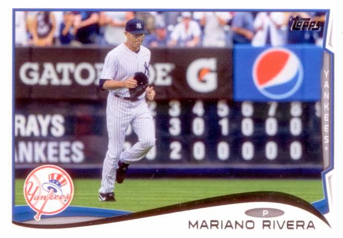
Mariano's final Topps card? I doubt it, but the photo is fantastic. Mariano marches from the bullpen to take the mound in his final game as a Yankee.

Play at the plate style action cards seem to be plentiful. I like cards when you can see more of the action going on in the background. Here you can see Kyle scoring at home while the catcher seems to be jumping to catch a high throw, allowing the runner at second to advance.

The opposite of play at the plate cards I guess would be the celebration at the plate. Here David Murphy and his Rangers teammates celebrate a win.

I love when pitchers are shown batting on their baseball card. Lord knows they have enough cards of traditional pitching images, so I like it when the card company mixes it up. This one will be going into my Batting Pitchers collection.

Topps just didn't include the superstars and young talent. Journeyman Bruce Chen also gets a spot on the Series 1 checklist. Why am I showing you his card? Bruce and I share the exact same birthday, 06/19/77. And he is a former Brave.

You've seen a good example of action shots. Then Topps includes this photo of Mark DeRosa. What the heck? Former Brave or not, this is a hideous card though I think someone out there will love it.

Out of 72 cards in the box I didn't get one freakin' Braves player. Ryan Doumit is the closest I got. For that reason alone I will buy another box of cards. While Ryan has been backing up Joe Mauer in Minnesota, Ryan I believe will be placed in the outfield in Atlanta since Brian McCann's departure from the team frees up home plate catching duties for El Oso Blanco (Evan Gattis). Ryan may also fill in at first to give Freddie Freeman a day off.
On the parallel and insert front I wasn't impressed. Most of the inserts look very bland and boring. A lot of the inserts have tiers such as auto and relic versions, but the basic inserts are blah. From what I've seen online I gotta say the 1989 die-cut minis look pretty cool, but my box was void of one of those. Let's start w/ the parallels I got.


Somewhere in the middle of my brick of cards I found these two yellow parallels. They aren't serially numbered and I couldn't find the odds listed on the back of the hanger box. Gold parallels are listed at 1:2, but those are supposed to be numbered. Can anyone shed some light on these for me?
They look pretty cool since yellow isn't used much on modern baseball cards. These give me a 90's Classic or 91 Fleer vibe. A little tacky, but I like them. I can see myself tracking down the yellow parallels of Braves players along w/ Tim Hudson.


Red bordered parallels return to Target packs. I like the red parallels for my Braves players, but a red border on an A's card? No thank you.

Here is another parallel that I couldn't find any odds for on the box. It's shiny red, kind of like last year's Emerald parallels or the stuff used in Bowman. Looks better in hand than my scan shows. I'll track down the red version of Tim Hudson, but I think that's about it. No Braves unless I find them uber cheap or someone sends them to me.

Super Veteran cards look alright. The top bar is gold foil along w/ the player's name and years in each corner. I'll have to look up the checklist to see if another player excites me more than a Redbird like Wainwright.

50 Years of the Draft may have some promise depending on the checklist. The best thing about this set is the lack of foil over use!

The Future is Now is probably my favorite set in terms of design. Love the full bleed photo and the fact that the silver foil is used minimally.

I thought Topps was done w/ the gold themed inserts and then they pull this Upper Class insert on us. I can't muster up anything positive to say about this design. Ugly frame, too much gold foil and boring photos.
All in all I like what Topps has done with the 2014 set. I know my box isn't representative of what else can be found, but they seem to be off to a good start. Most of these inserts will be available for Braves parallels and inserts from 2014 Topps. I may test the water with a few of these on eBay just for giggles. Have fun everyone, 2014 baseball is finally here!
You know you watch way too much CFL when you try to determine if that is a CFL or NFL football in the DeRosa. Based on size, it shamefully appears to be the latter.
ReplyDeleteI did the same thing, that lack of stripes is a dead giveaway, pretty disappointed a team that shares a stadium with the Argonauts doesn't have a CFL ball around.
DeleteShame on Topps for using such a horrible picture to begin with!
Deletethere are at least 11 parallels this year not counting printing plates. The yellow parallels are suppose to be a retail exclusive. And that red sparkly card is card a red hot foil, not to be confused with the red Target exclusives. Topps has been teasing the last week with photos of some of the bigger hits on facebook and twitter. And cards have been up on ebay for a while now, but the really good hits won't come till hobby officially hits tomorrow. I'll save any Brave parallels and inserts I find for you.
ReplyDeleteThanks for the info!!
DeleteGetting confused with all these parallels :-)
ReplyDeleteYou and me both!
DeleteI like DeRosa and that card. Guess I'm in the minority. Gotta have some fun. I'd have liked to have seen the whole set look like that Profar. Just substitute the team logo for the Future is Now.
ReplyDelete